Vishwas translates to Trust.
The synthesised route takes a graphical approach to the name itself and the philosophy at the heart of the brand.

A trusty “tick” which forms from a data point (crucial for stock markets) and also represents the “V” from the brand name. The symbol is also balanced by the modernity granted by the open source typefaces - Space Grotesk (for the Logotype), and Inter.
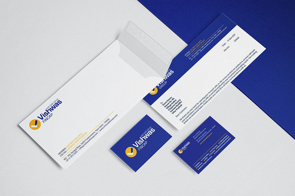
The complementary color palette with the base of Blue instills trust and reliance in the subconscious of viewers with Yellow signifying Gold and allied connotations.
The anatomy of the logo

Logo Variants

Dynamic Variants

Colours

Typography

Imagery

Usage
Billboard Mockups


Banner Advertisements

Social Media Posts


Contextual Emailer

UI Sample


Comments